Blowing Up The Death Star.
The packed bubble chart, despite its versatility, may be off-putting because there are no markers that can be followed instinctively, such as time or distance.
Its complexity derives from the inclusion of so many factors; instead of a simple X and Y axis dynamic, it includes time in years, Departments, the Deputy asking the question and whether the question was asked orally or in written form.
It may be worth taking some time to break down the elements involved in the parliamentary process to see if single elements or groups of elements either improve or disimprove this exploration of parliamentary questions.
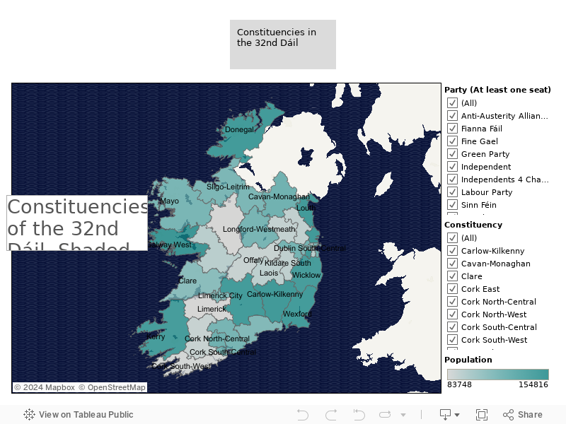
Of the several pieces of “metadata” that may readily be applied to Dáil Deputies, one of the more obviously related to their interests is the constituency they represent, available on the Ordnance Survey Ireland website as geodata.
Visualising this dataset can be enhanced with the inclusion of other data, including population, while bringing in related Deputy attributes, including party affiliation.